The Saint
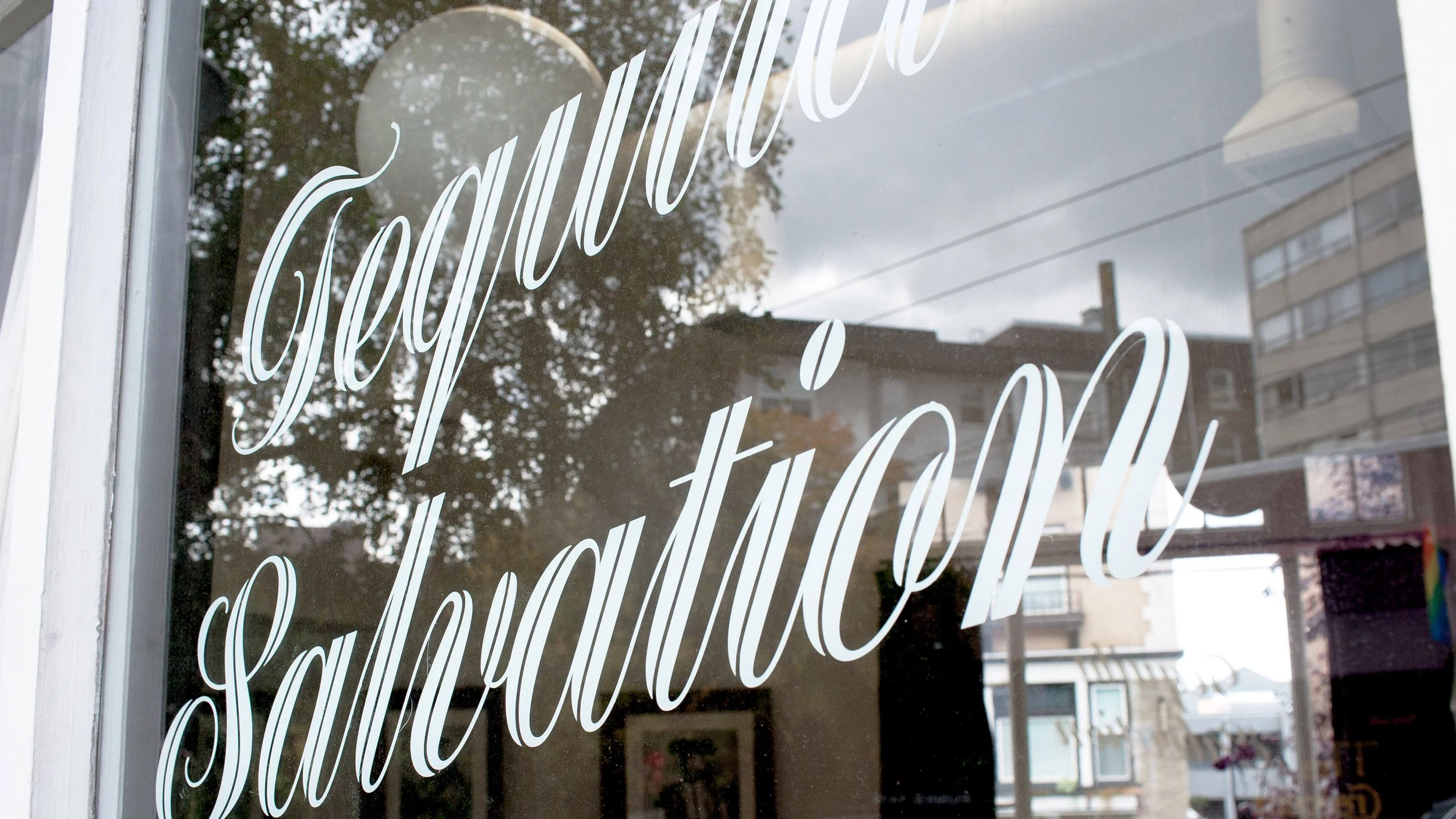
A destination for Tequila Salvation
The Saint’s mission statement was simple—Elevate the status of Tequila to equal the tradition of its rich and celebrated history. At the time of its founding, at the onset of Tequila’s insurgence, it was still considered a shot or party drink, primarily remembered for brutal college hangovers, and not on the same tier of sophistication or nuance as other spirits like scotch or bourbon. As Seattle’s first dedicated Tequila bar, the Saint's brand needed to be as simple and elegant as its mission. It needed to be confident and bold, yet have the integrity to be reserved.
Our solution was to design an identity that was crisp and elemental, much like Tequila itself. A single color, a bright agave blue, was chosen for use throughout, paired with a modern typographic palette used with strict modernist principles. Together, these elements served as an intentional counterpoint to stereotypical Mexican restaurant design, which focused on rustic motifs, traditional Catholic imagery, and red, white, and green color palettes. Our interpretation of the word “Saint” moved away from religious connotations and positioned everyday heroes —Matadors —as colloquial Saints. An icon of a horse-mounted matador with a raised sword became the restaurant's logo.
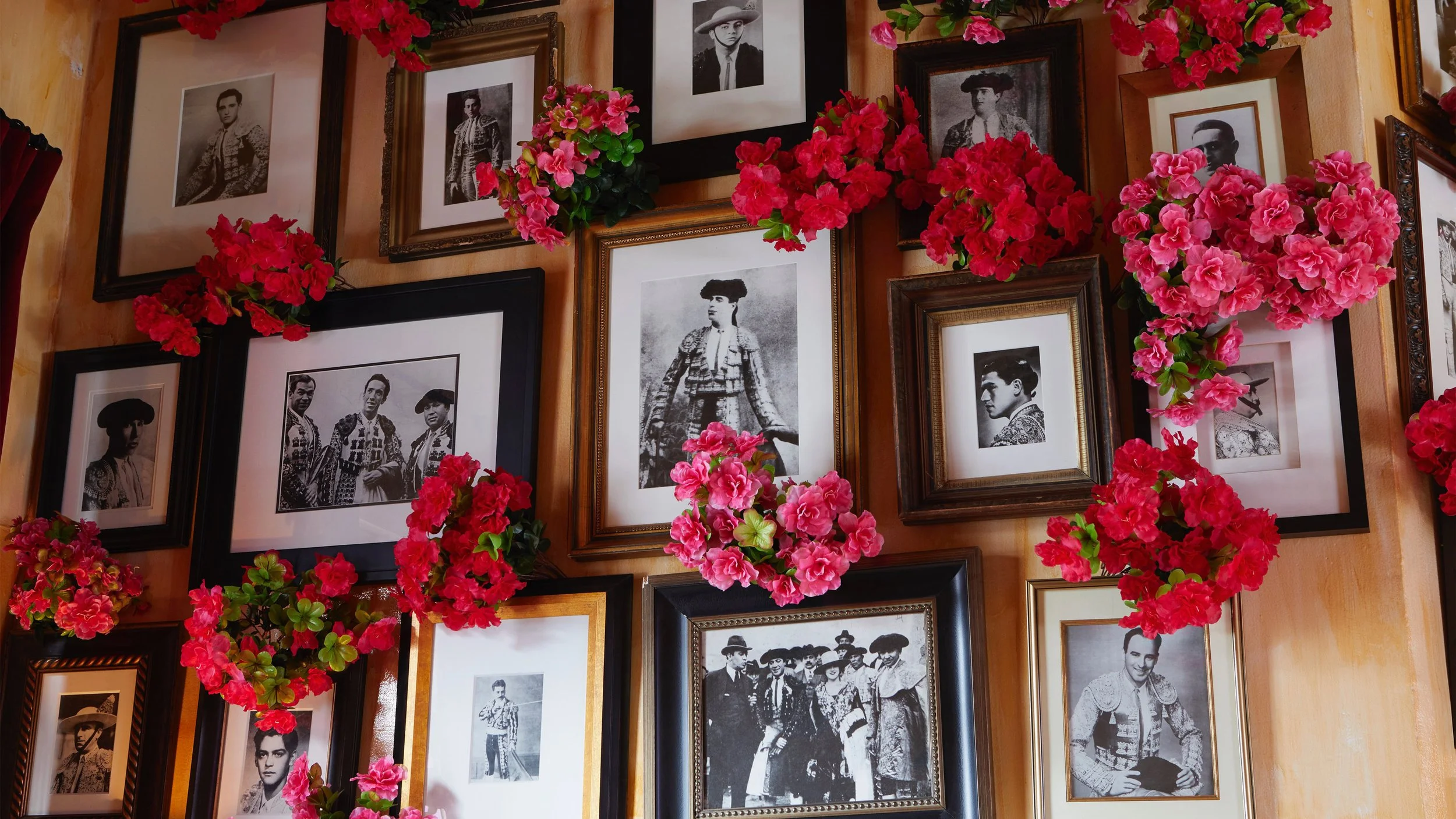
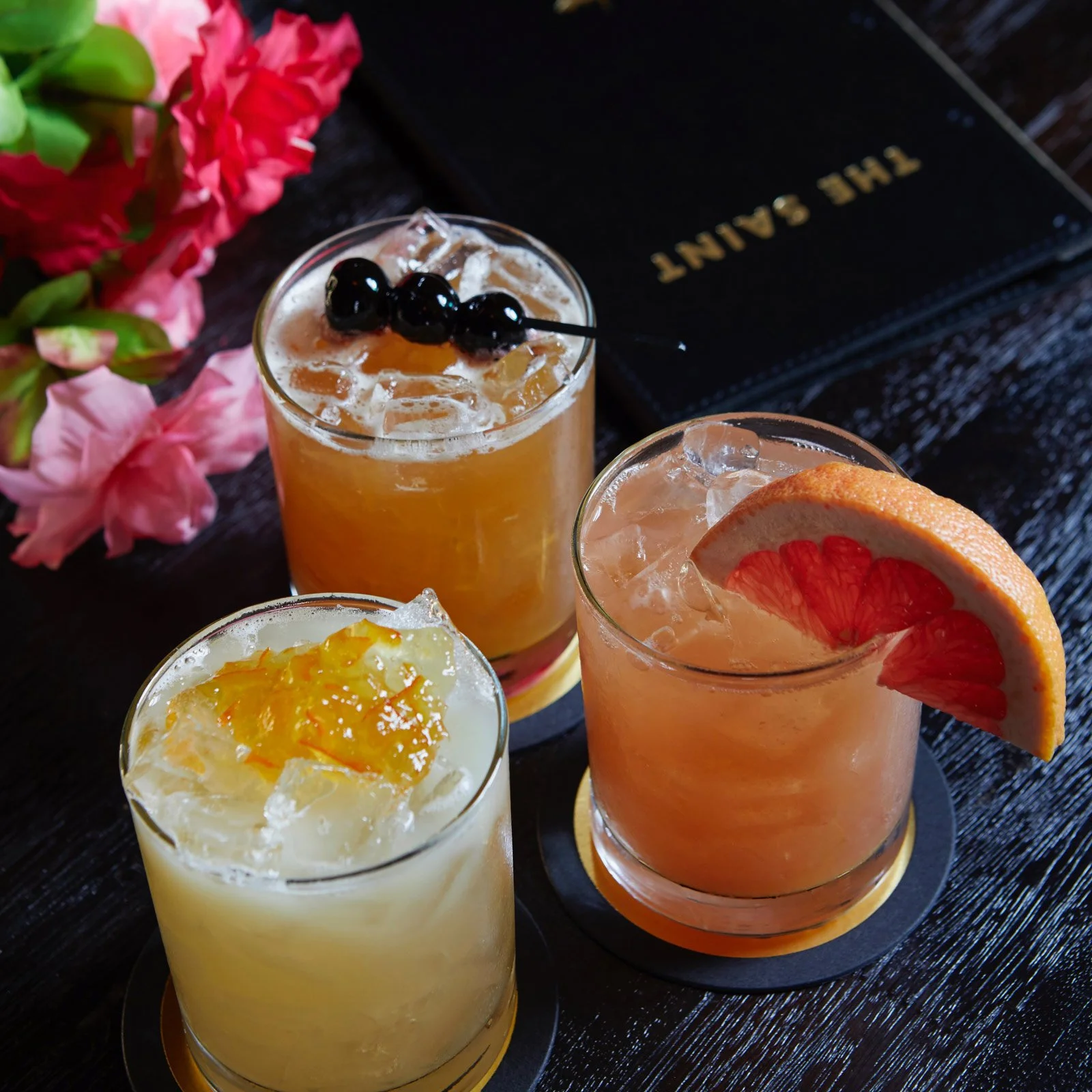
Situated in an iconic, standalone, triangular building painted in bright agave blue, the space featured dozens of framed vintage portraits of matadors, walls of wheat-pasted matador posters, and a go-to destination for exquisite craft Tequila cocktails and award-winning Mexican cuisine.
Roles:
Strategy
Brand Development
Brand Articulation
Brand Narrative
Brand Stewardship
Program Development
Seasonal Campaign Development
Creative Direction
Art Direction
Identity Design
Design
Illustration
Collateral Design
Copywriting
Digital Experience
Environmental Design


More Work
Logos & Wordmarks

Westland Cask Exchange
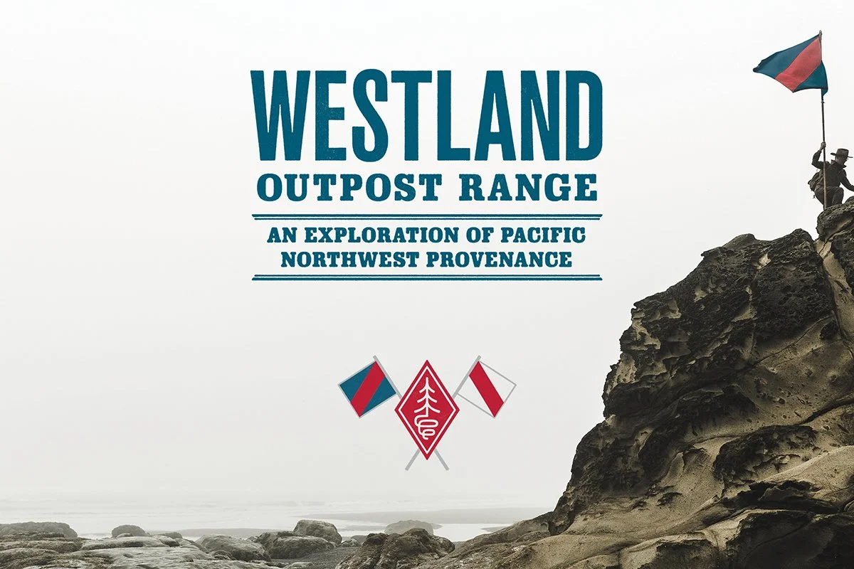
The Outpost Range
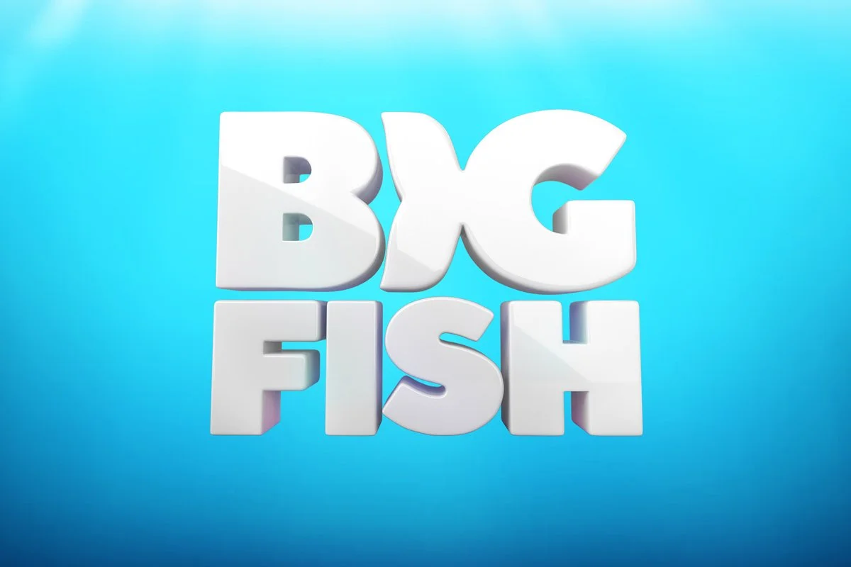
Big Fish Games
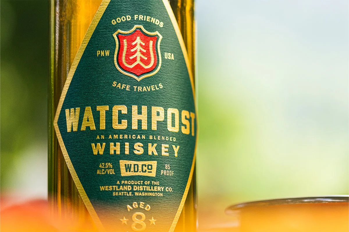
Watchpost Whiskey

Undead Labs

Westland Whiskey
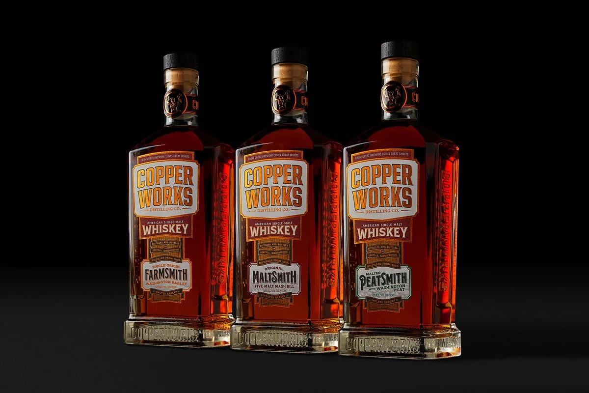
Copperworks Distilling Co.

Mr. Moxey's Mints
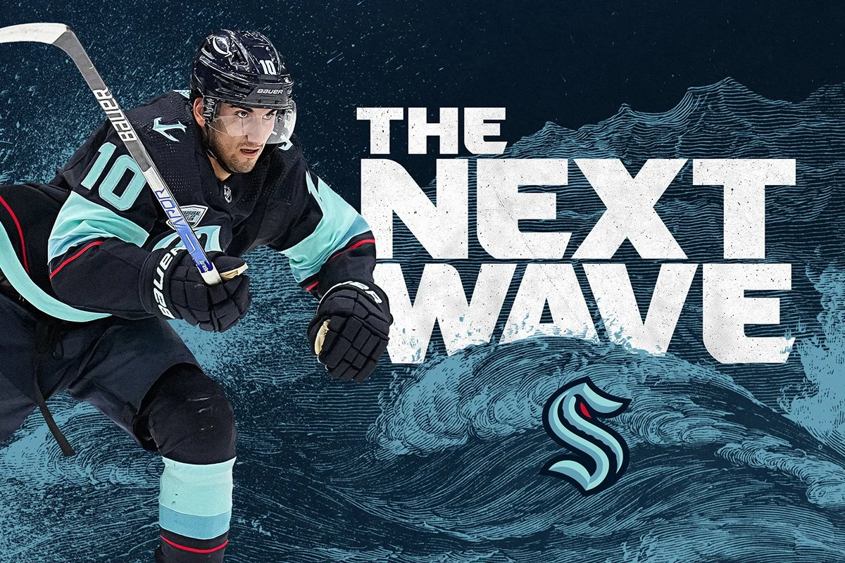
Seattle Kraken
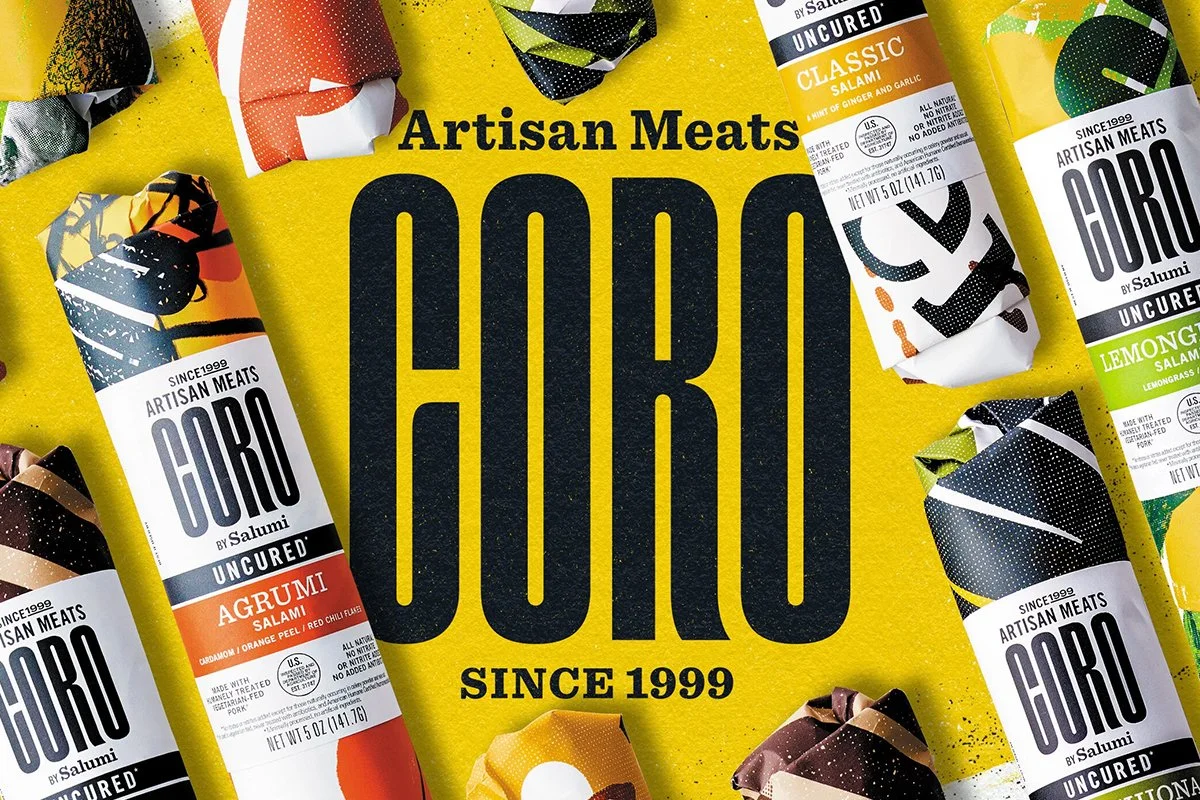
Coro Artisan Meats
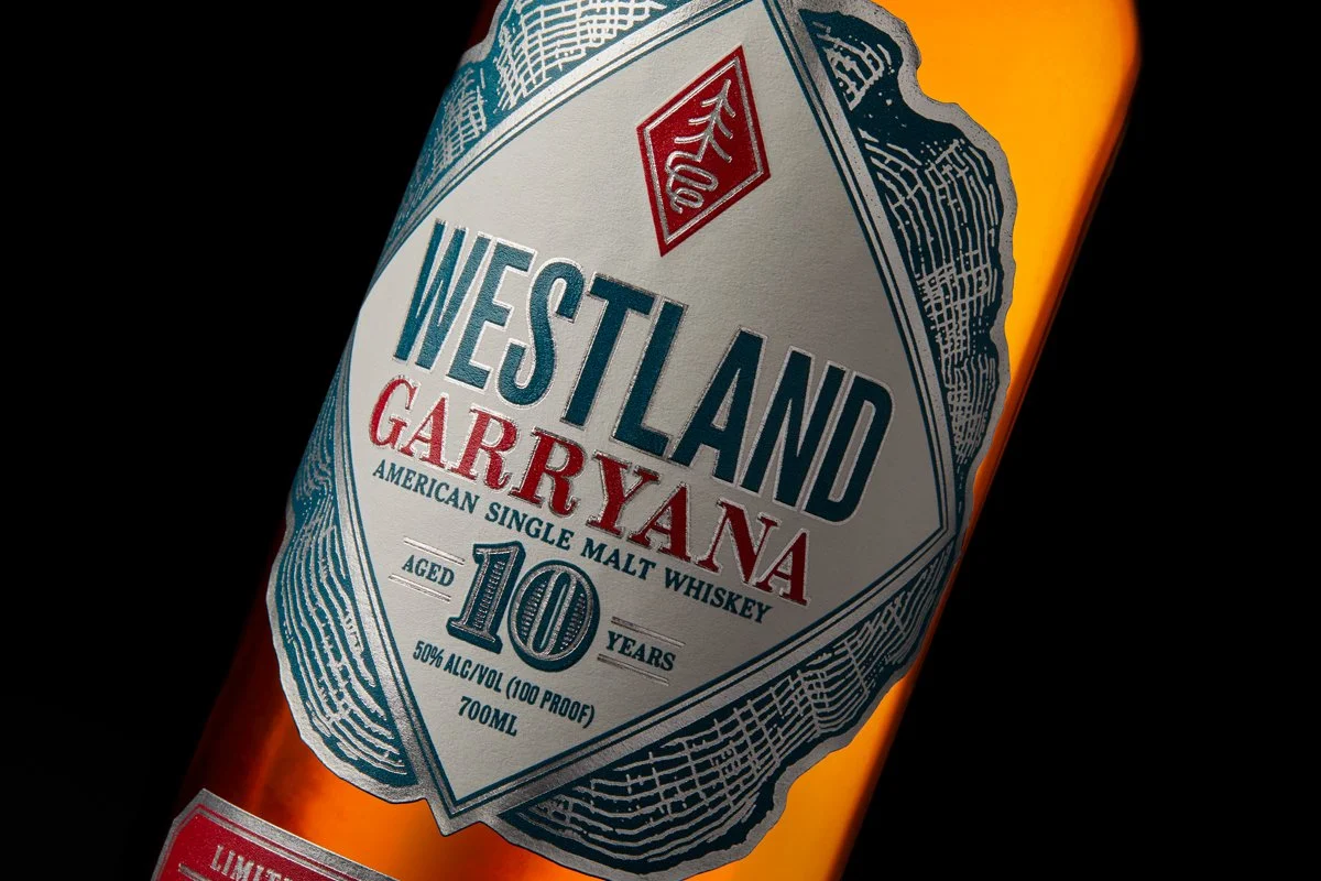
Garryana 10th Edition

Mark Funke Rare Books

Benson Amps
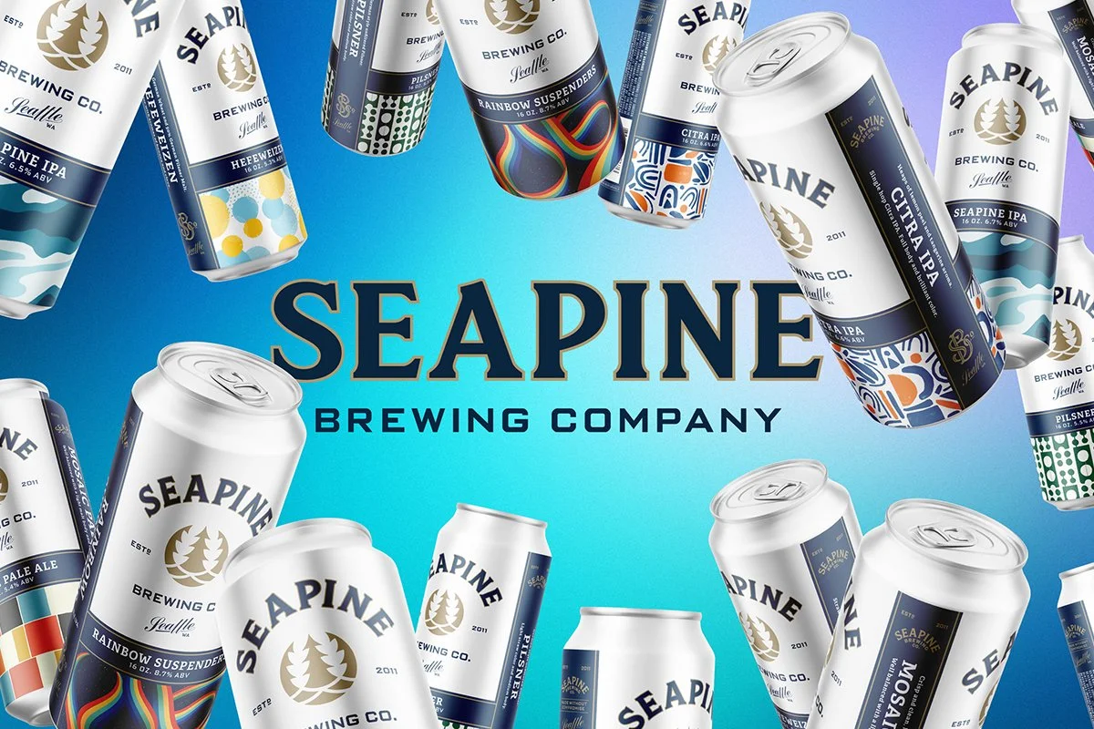
Seapine Brewing Company
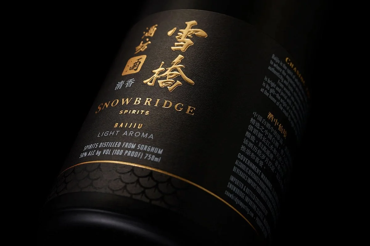
Snowbridge Spirits
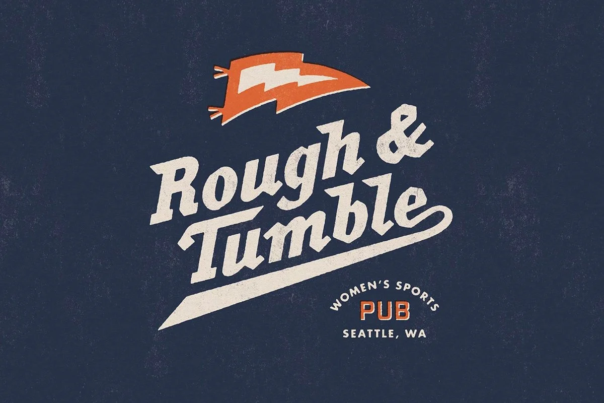
Rough & Tumble Pub

Modular
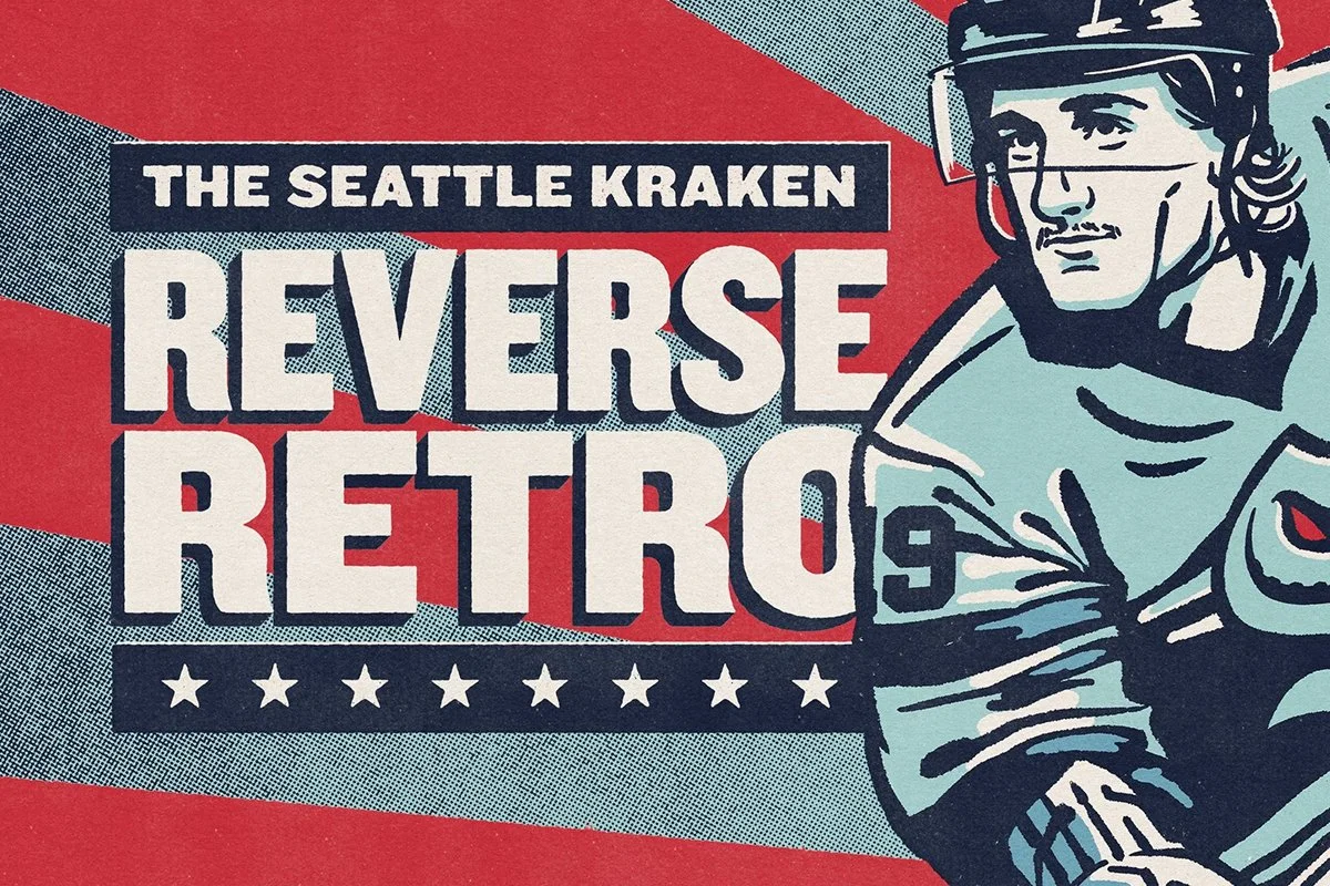
Reverse Retro
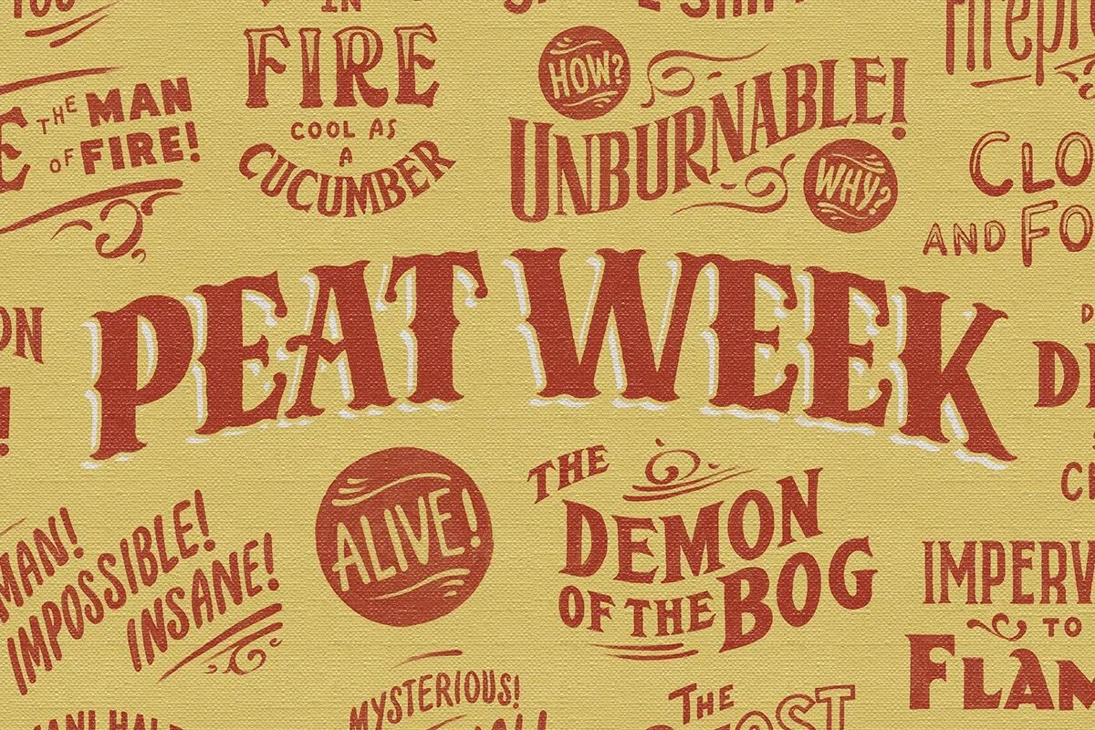
Peat Week

Hazlewood Bar

Coldfoot Whiskey

Steep Echo

Taphandles
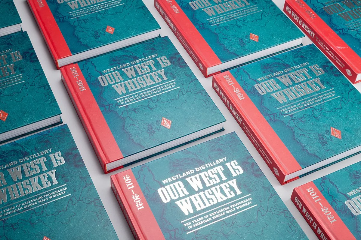
Our West is Whiskey

The Rabbit Box

The Saint