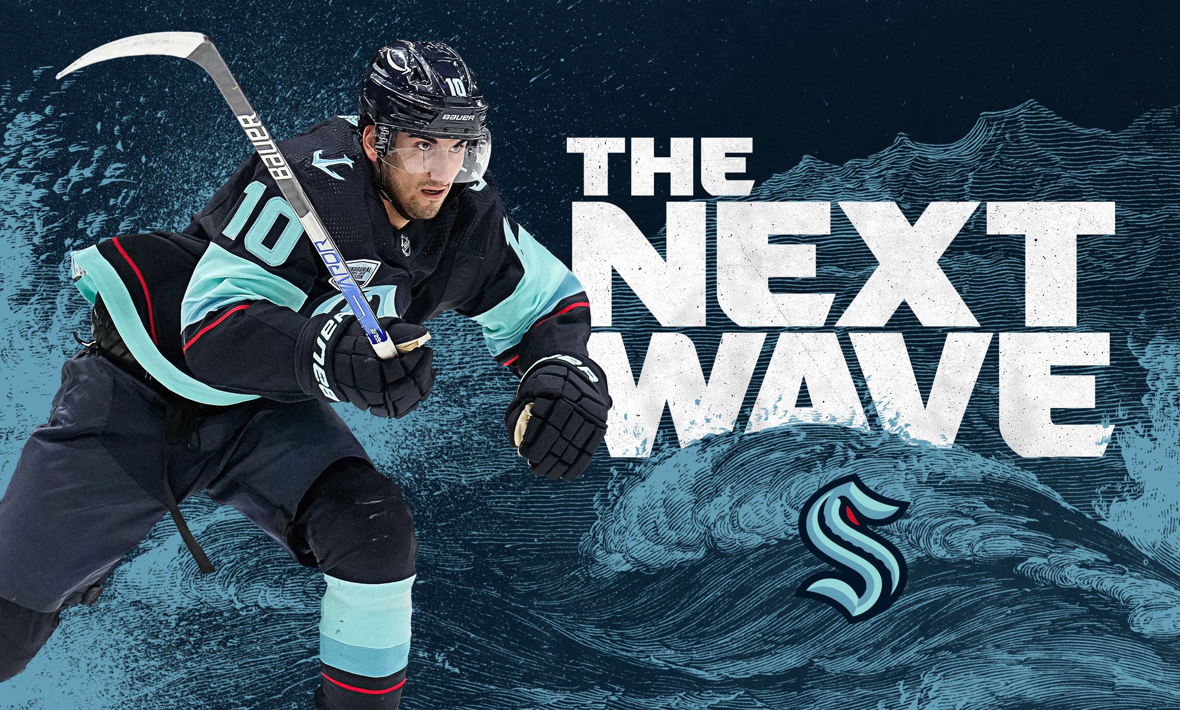
Seattle Kraken
Riding the wave relentless
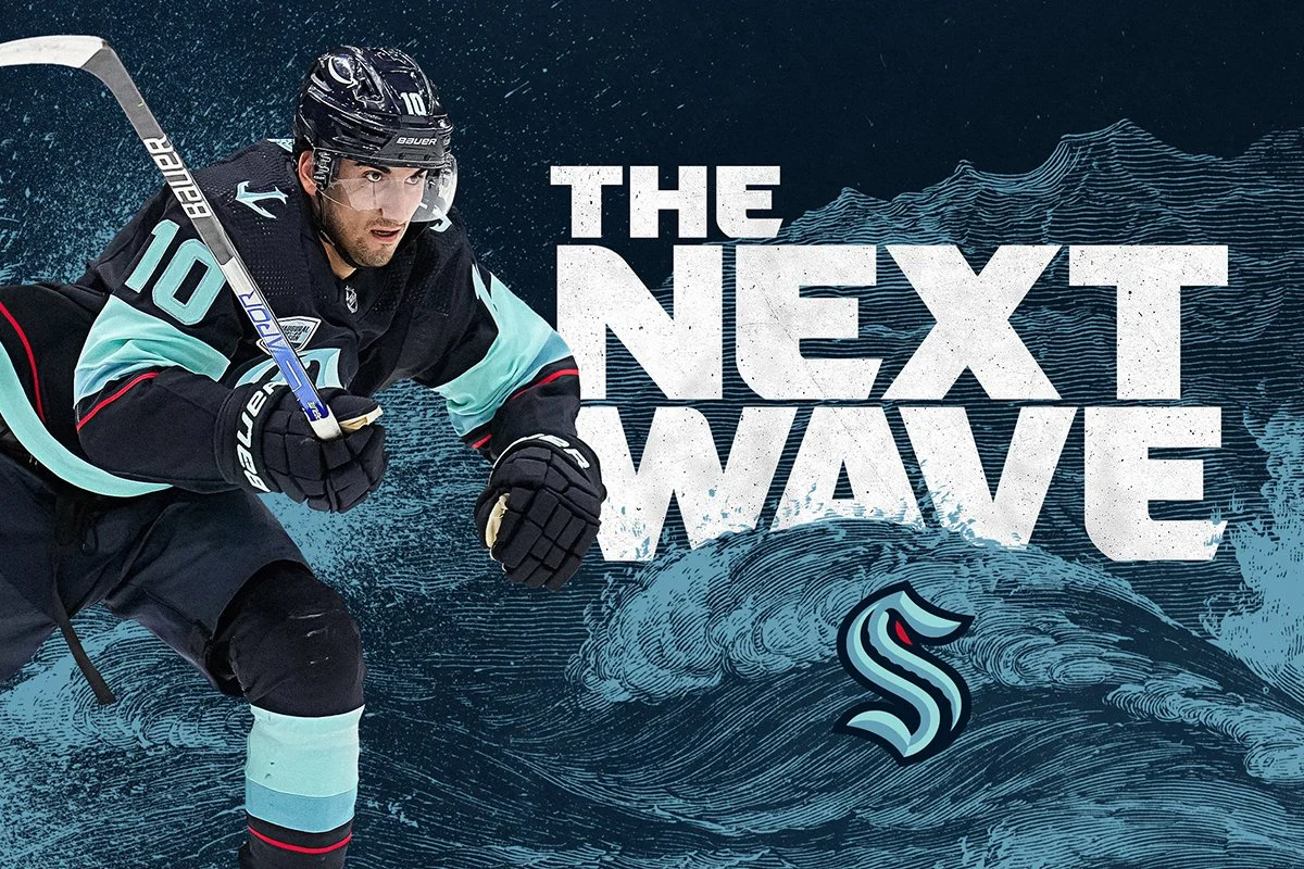
We partnered with the Seattle Kraken at the onset of their second season in the NHL to help establish the look, feel, and verbal tone for their seasonal campaign. Tied to the team's nautical themes and the Seattle region, we created a toolkit of graphic assets consisting of rough seas and vintage nautical navigation elements, paired with a collection of taglines and slogans and action photography of the players. The campaign was used throughout the season across Seattle through print advertising, billboards, bus wraps, posters, TV advertising, social media, and in-game motion graphics.
Roles:
Asset Development
Seasonal Campaign Development
Creative Direction
Art Direction
Design
Type Design
Illustration
Collateral Design
Copywriting


Custom Typography
The team’s custom typeface was designed with only two weights, regular and bold, which was very limiting within the design. To bring more dynamic qualities and variation to the typographic layouts, we created multiple new weights and built custom type treatments of our taglines and slogans.


A playoff frenzy
After an incredible second season, the team headed into the playoffs for the first time. We evolved the assets of the original campaign to bring a new level of intensity to the look. Incorporating new language, type treatments, textures, and player photography, the playoff campaign captured the speed of the games and the frenzy of the fans.


More Work
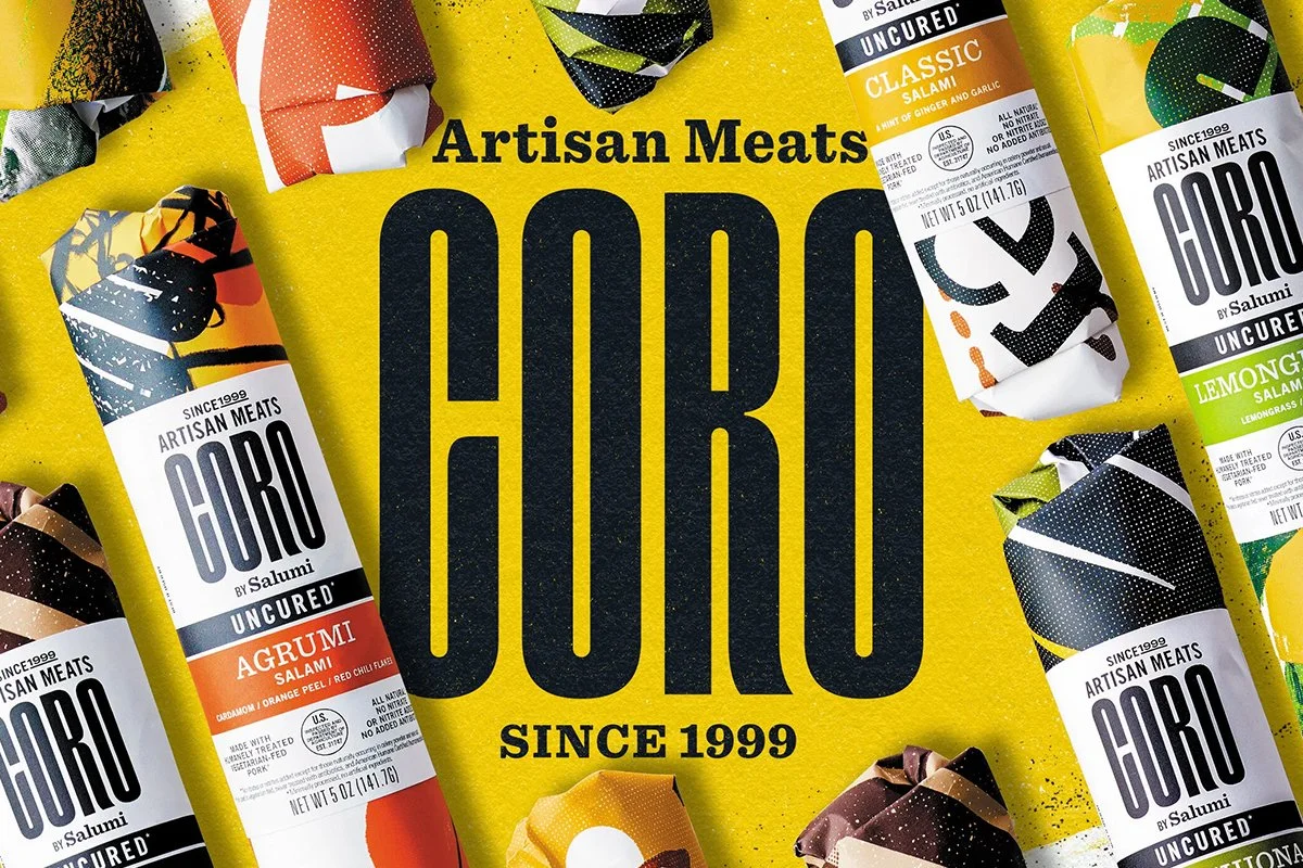
Coro Artisan Meats
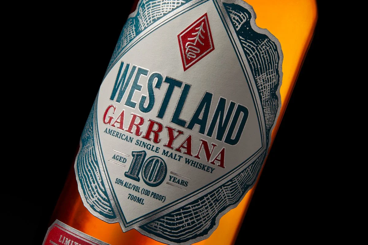
Garryana 10th Edition

Mark Funke Rare Books

Benson Amps
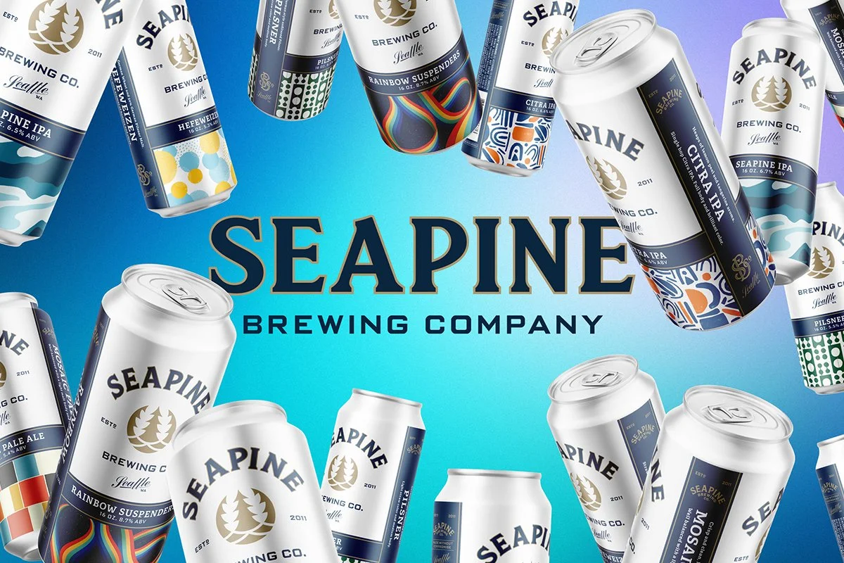
Seapine Brewing Company
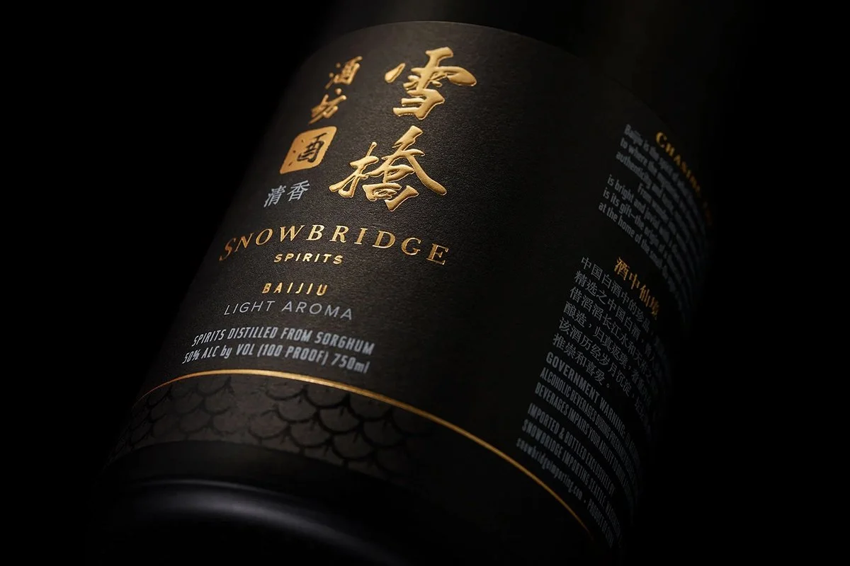
Snowbridge Spirits
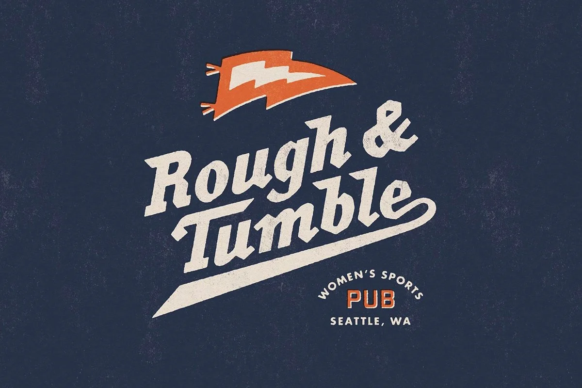
Rough & Tumble Pub

Modular
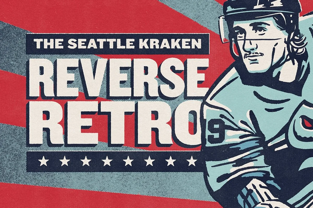
Reverse Retro
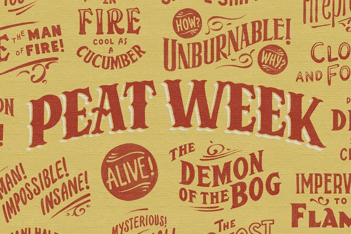
Peat Week

Hazlewood Bar

Coldfoot Whiskey

Steep Echo
Taphandles
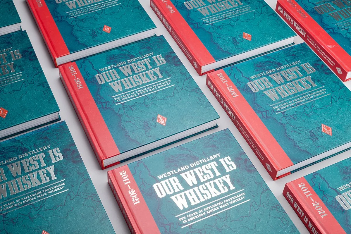
Our West is Whiskey
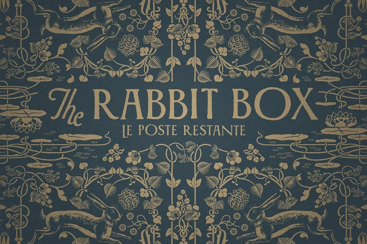
The Rabbit Box

The Saint
Logos & Wordmarks

Westland Cask Exchange
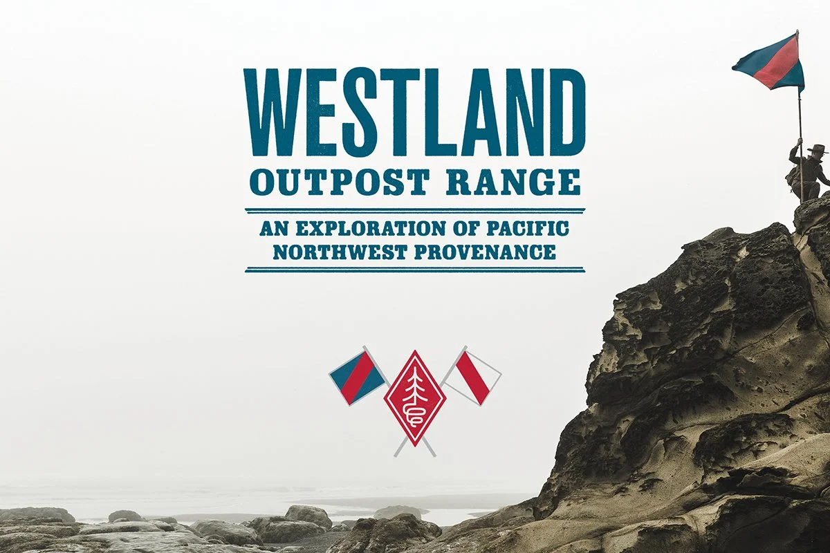
The Outpost Range
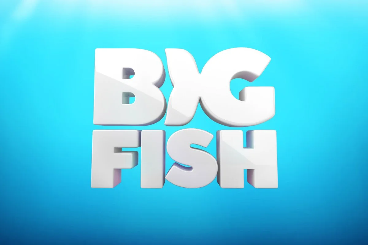
Big Fish Games
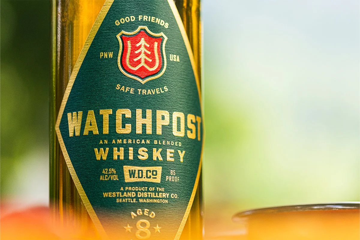
Watchpost Whiskey

Undead Labs

Westland Whiskey
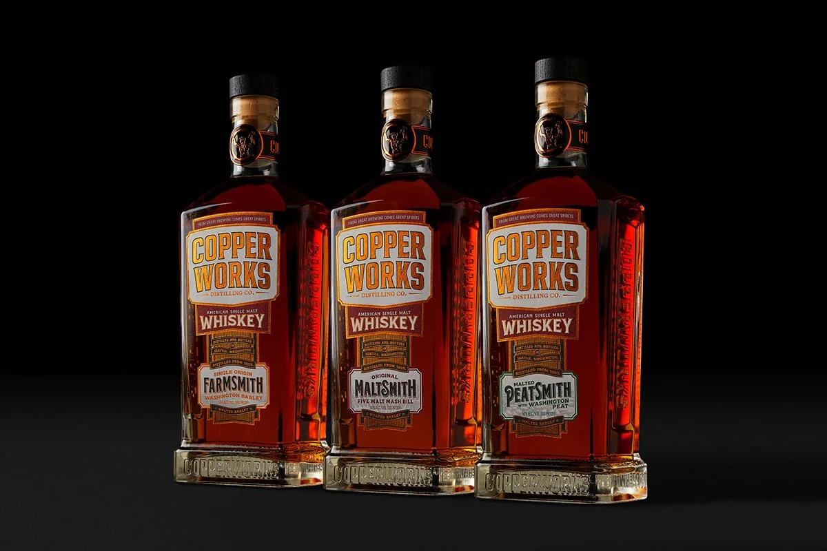
Copperworks Distilling Co.

Mr. Moxey's Mints
Seattle Kraken